Antonino Saggio I Quaderni
On this topic, please refer to the Book
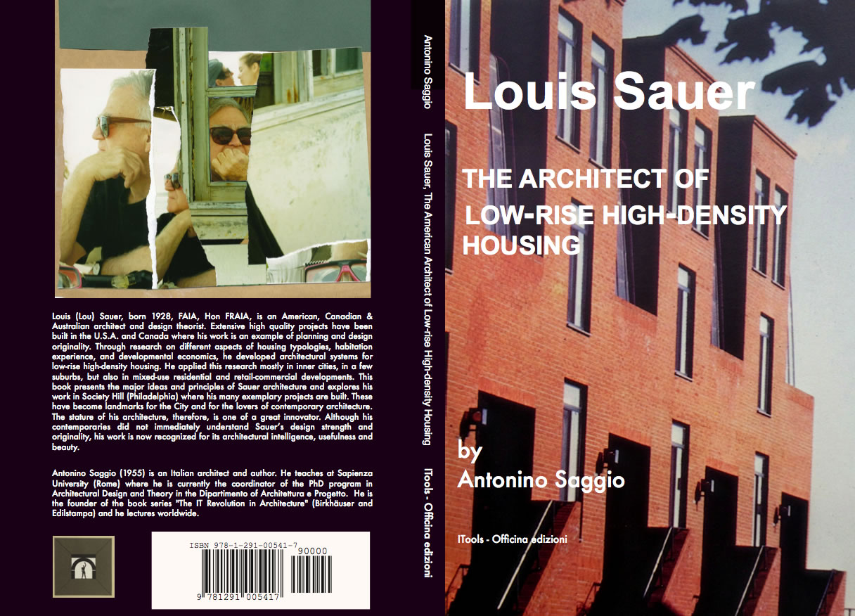
Introduction In 1956 the faculty at the CIAM's Summer School in Venice included Giuseppe Samonà, Ernesto Rogers, Giancarlo De Carlo, Gino Valle and others; among the students was a small group of English-speaking Italians and several dozen non-Italians, including Louis Sauer, who joined at the last moment. Sauer was born in 1928 and graduated from the Chicago Institute of Design, founded by Moholy Nagy. At the CIAM Course (it was the year of Dubrovnik) he formed contacts with his Italian and non-Italian colleagues (later he set up a partnership with Giancarlo Guarda, whom he met on that occasion), presented a display of his photos and stayed another six months in Venice to study and assimilate the city's architecture. In the 1960s and 70s, after taking his Master's degree with Louis Kahn, he made his name in the US as one of the major experts on housing. He designed about forty residential complexes, some of them notable, like the 180 home units in the new town of Reston, Virginia, or Harbor Walk, 400 homes as part of a redevelopment project for Baltimore Bay. Coordinated by Edmund Bacon, a major urban rehabilitation project was being carried out at Society Hill and Sauer constructed a dozen buildings, including Penn's Landing Square which took up a whole block with 118 homes-units. I met Sauer in 1982 when he was Dean of Carnegie-Mellon in Pittsburgh and I studied for my Master's with him as housing design was the centre of my work. As a Fulbright scholar I was his student, assistant and back-up teacher; as an architect he was my master; as a person, a friend. On returning to Italy I continued to travel back and forth between here and America; I systematised his work and published it at various times since 1988.
I immediately thought of Louis when I was asked to give a paper at the ILAUD Residential Course in Venice. I thought of the student-architects coming to Venice from all over the world, forty years after that CIAM Summer Course and the same age as Sauer was then. ILAUD certainly owes something to the pioneering experience of the CIAM Summer Course and not just because of the presence of De Carlo, who also organised the 1956 one. A lot of things have changed since then. Not the fact that architects need to study, debate and exchange ideas with citizens, administrators and builders, but that their job, ultimately, is to get things done: deft, intelligent designs that slice through bureaucracy and tiredness like a rapier. So, the CIAM Summer School at Venice in the '50s (the themes of a triennial of that experience included the Tronchetto and the Biennale Gardens) and ILAUD forty years later with the island of Sant'Elena: think of the continuities and differences, the reflections and observations we might continue to weave together. A second reason for the choice was that the intellectual figure of Sauer and his achievement, though so close to ILAUD and in many ways an organic part of it, deserve to be presented directly, even if this risks being less popular. (Gehry, Eisenman or even Terragni have much greater appeal). Somehow nowadays it's unfashionable to arrive at architecture from the difficult field of housing. You come up against the old theme of ëexceptional' architecture and ëeveryday' architecture: but isn't that a false problem? But the decisive reason behind my choice was different. I thought about the evolution of Louis's work and the many discussions together about Venice. I reflected that in the experiences of the student-architects here in 1997 there will be two phases. The first is the ëcontact', the four weeks passed physically in the city with the challenge of a project to tackle; the second will be the process of ëincubation'. A personal reflection, lasting I suppose all one's life, where the seed of Venetian architecture will continue to grow. At least this is what happened to Louis Sauer. Using his work as an instrument, I want, in short, to plant the seed of this city even deeper. It is sure to grow.
Venice teaches
To try and establish in pedestrian
fashion just how the knowledge of Venetian architecture developed in Sauer
would be sterile scholarship, because ideas and promptings in the mind
of an architect are fluid and interwoven, but even a cursory glance enables
you to trace the succession of systems of contracted or dilated spaces,
the quest for forms of hardness of construction against the mobility of
water and the mechanism of distribution typical of the Venetian residential
fabric. It is, however, worth explaining just why, for an architect like
Sauer of the post-CIAM generation, Venice represented an even more important
lesson. In fact I'd say there are two lessons: the first is connected with
the concept of urban space: the second - the same thing from a different
viewpoint - is the context.
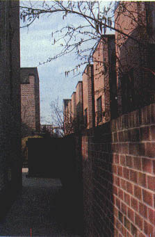
Penn's Landing square, Philadelphia While Sauer was assimilating
a conception of the architect's work rooted in the functionalist tradition
(hence practical adherence to a theme, an attempt to influence society
through architectural design, a scientific conception of the gradual accumulation
of understanding as opposed to the academic and formalist concept of the
single splendid gesture), he also had an idea of urban space that was opposed
to the functionalist concept. He rejected the separation of building from
ground (with isolated volumes suspended on an even level surface, continuous
and laid out as a garden, of the Charter of Athens), replacing it with
the idea of an interwoven fabric. The ground is no longer a surface on
which to rest volumes but a whole to be designed carefully as a compact
whole, in which spaces, streets, buildings, gardens and paved areas all
interact. His designs are governed by a homogeneous grid, but the grid
empties, opens and closes to create a continuum of relationships between
the various parts and evoke the small pathways, sudden surprises, the atmosphere
and values of the historic city, but applying new techniques and modern
standards. The second idea is closely bound up with the first. After an
emergency phase, with internationalized problems and standardized solutions,
the specific context in which each single architectural work has to be
created enters forcefully into a project. ëContext' is a necessarily
ambiguous term, because it indicates the specific morphology of the site
but also its historic and cultural stratifications. The consequence of
this is decisive: designing no longer means laying down ëmodels' that
can be inserted in a variety of different contexts (as the great masters
long thought), but the study of ëmethods', i.e. techniques of design
that are flexible and adaptable. From model to method means using the scientific
approach of functionalism at a much higher and more complex level: to aim
at diversified solutions and their flexibility, to leave the architecture
free in planimetric and volumetric compositions, to adhere to the programs
and interpretations that everyone has of the context. Now Venice may well
have offered a source of forms, styles, colours, atmosphere, materials
and so forth, and also a help to understanding, like few other cities in
the world, precisely these two key facts. How urban space can be based
on a continuous fabric (though articulated in a variety of ways) and how
architecture, especially housing, can concretely create this fabric, based
on a continuous series of variations within a set of guidelines. Like,
for example, low rise/high density. Low-rise high-density housing In many ways Venice is the source of the system of development called ëlow-rise high-density': a way of conceiving urban space that overturns the Functionalist logic of separating buildings from the ground, being based on continuity, articulation, territoriality. This strategy, present in the experience of some of the members of Team X, was used by the Swiss architects of Atelier 5, and other pioneers like Darbourne & Deave or Neave Brown in Britain: but some of its most convincing and mature achievements are found in the works of Sauer. They range from the creation of sections of new towns to low-cost housing in extensions of the city, to particularly delicate projects inserted in the fabric of existing cities, like the historic complex at Society Hill. Low-rise high-density housing is based ultimately on four principles: - to reach adequate real-estate densities suited to an urban setting (350-550 inhabitants per hectare) through blocks not more than four storeys high; - to provide each home-unit with a strong sense of individuality with the clear identification of separate elements of access, as far as possible directly from ground level; - to eliminate spaces without a precise territorial connotation, in particular to privatize most of the outside spaces by relating them directly to home-units; - instead of keeping housing blocks, streets
and spaces separate, to create continuity of the constructions by a system
of ëbuilt fabric', governed by a grid and achieved by a system of
ëoverlapping home-units'.
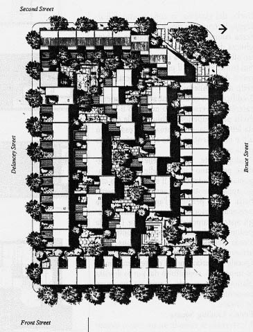
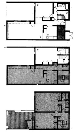
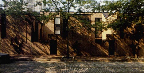
Penn's Landing Square, the most significant project at Society Hill and the only one we can examine here, was designed through a succession of laborious drafts. In the final draft Sauer passed from 25 home-units per acre (about 250 inhabitants per hectare) to 50 home-units per acre, so with a real-estate density twice the earlier scheme. The project is based on continuity of the outer perimeter to defend spatial variation in the internal pedestrian and public spaces; the insertion of underground parking in the lower part of the block; the location of town houses along two of the outer fronts; but the basic instrument used to create the project (above all the challenge of achieving high density within the limit of three-storeys), was the invention of a "housing package" of superimposed units. There are five fundamental ideas underlying this solution (they are at once technical and distributive, planimetric and formal): - The package is based on two structural bays of 4.20 m to form modules of about 8.80 m arranged along the grid, which decides the size of the project in constructional and spatial terms. The linear aggregation permits both the alignment of the home-units as a continuous row on one of the outer fronts as well as enabling them to be staggered independently from each other inside the perimeter. - Within the homes, the different surface areas of the units (from about 80 to 135 sq m) is achieved by extending into the space of the adjoining structural bay, where necessary, and so forming either units on one floor only, or on two floors in two bays, or in one bay on one floor and two on the floor above. The flexibility in the size of the units also stems from the decision to locate the staircase along one front orthogonally positioned in relation to a bay. The result is that the units are organised through a division into a service belt (stairs, entrance, bathroom) and a served belt (living-room, dining-room and bedrooms). - The service-served organisation is also functional in terms of density. The served front of one row faces onto the service front of another. This enables the fronts of the parallel rows of housing to be brought much closer together, ensuring the high densities required, but avoids an 'introverted' building. Moreover the served front is oriented south to optimise the exposition. - The actual functionality of the system is guaranteed by its L-shaped layout which gives an extra front compared with rectangular layouts. On the ground floor, where the problem of light is greater, the served front opens onto the inside of the 'L' towards the private garden. On the upper floors the built masses are stepped back so that part of the surface area becomes a terrace. In this way, instead of being based on the typical functionalist approach which has a standard cell aggregated along a layout to form a model building (itself multiplied x times to create the neighbourhood), the project is based on a triad consisting of cell-housing package-building. - The package contains within itself the home-units and system of distribution, and the single packages are not constructed by a system of distribution on a higher scale. Hence it is the various aggregations and combinations of the housing package that enable the complex to be organised to meet the requirementrs and characteristics of spaces, internal planimetric links and external relations with the city.
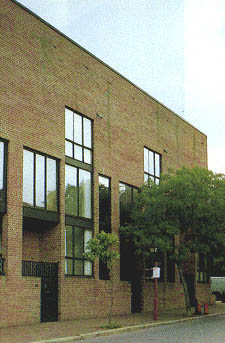
Penn's Landing square, Philadelphia Form and context The housing package makes it possible to achieve an articulation of internal spaces based on the contraction and dilation of interiors in a sequence of contrasts of light and shade, solids and voids, public and private ambits. The source of these alternations was Sauer's love for the way the little calle leads to a campo, and the campo in turn to a calle, a fondamenta or a smaller campo. But in this project, like all Sauer's designs, there is a big difference between interior and exterior. Here the outer perimeter is continuous and rigid and at first could be seen as a great wall enclosing the project. Yet if you look at it at more closely you discover important variations in this wall. The small residential scale of the existing houses on one side is expressed by identiyfing the individual home units, rhythmically marked off by the volumes of the terraces running along the street front. By contrast a second front appears as a surface only cut into by windows, creating the effect of an urban screen for the buildings terminating the street and an introduction to the corner volumes of the main entrance. On the other two sides, to respond to the distant view from across the Delaware River, a strong, compact screen is created by increasing the height of the front (inclining the roof inwards) and grouping the windows together. The integrity of the surface facing the river is achieved by the compact band running along the top, while the attachment at ground level is rhythmically marked by the apertures containing the entrances and enriching the perception of viewers on the sidewalk. Penn's Landing Square is an important project for understanding how to design in a built city, how to replace derelict housing and redevelop industrial sites or docklands, like Society Hill in the past and some parts of Venice now. Of course this is an exclusively residential project, while today we tend to seek a mix of functions so as to revive inner cities. Here the underlying concept is of a fabric based on a grid and the way it is filled or emptied, while in Venice the approach may be as well to start from the possibility of working with forms, i.e. through morphologies that are dynamic right form the start. The most important recent projects at Venice, one on the Giudecca and and the other on Mazzorbo, indicate precisely these two different approaches. Some details of Sauer's design may not convince everybody, but I feel whoever believes that the road of architectural research must pass through housing will find this project absolutely essential. The fact that, at least in the architect's aspirations, it has a lot of Venice in it is one more reason to present it here at ILAUD 1997. Antonino Saggio Author Address: To continue:
di Antonino Saggio (ii) I singoli pacchetti possono articolare gli spazi collettivi interni in una successione di ambiti piccoli e grandi in virtù della flessibilità del sistema adottato per gli ingressi. Ogni pacchetto è infatti dotato di due scale per cui quale che sia la grandezza dell'alloggio e il piano su cui si sviluppa, l'entrata privata viene sempre posta al piano terra. (iii) All'interno dell'unità, la diversa superficie degli alloggi (dagli 80 ai 135 metri quadri circa) è raggiunta inglobando o meno lo spazio della campata strutturale adiacente e formando così alloggi a un piano solo, a due piani su due campate o di una campata a un piano e di due a quello superiore. La flessibilità dei tagli di alloggio deriva anche dalla scelta della localizzazione della scala lungo un fronte in posizione ortogonale rispetto alla campata. Ne consegue che l'alloggio è organizzato attraverso una divisione in una fascia servente (sistema delle scale, entrata e bagni) e in un fascia servita (soggiorno pranzo e camere). (iv) L'organizzazione servita-servente è funzionale anche alla densità. Il fronte servito di una fila affaccia sul fronte servente di un'altra. Ciò consente di avvicinare moltissimo i fronti delle file parallele di abitazioni, garantendo le alte densità richieste, ma evitando l'introspezione. Inoltre il fronte servito viene orientato a meridione ottimizzando l'esposizione. (v) L'effettiva funzionalità del sistema è garantita attraverso una geometria a "L" che consente un ulteriore affaccio rispetto alle configurazioni rettangolari. Al piano terra, dove più sensibile sarebbe il problema dell'illuminazione, il fronte servito si apre all'interno della "L" verso il giardino privato. Ai piani superiori le masse edificate arretrano destinando parte della superficie a una terrazza.
Pubblicato in:
Per l'approfondimento
In inglese una buona fonte
per avere un quadro dell'attività di Sauer e una prima bibliografia
è AA.VV., Contemporary Architects, St. James, Chicago 1994.
In italiano si può consultare il mio Un architetto americano.
Louis Sauer, Officina, Roma 1988 e "Cinque Lavori di Louis Sauer. Relazione
con il contesto e ricerca espressiva di un architetto americano fuori dalle
mode", L'architettura cronache e storia, n. 407, settembre 1989
e "L'intervento nella città edificata. Residenze di Louis Sauer", Edilizia Popolare, n. 215, maggio-giugno 1991. Vedi anche |
Antonino Saggio - Home | Bibliography | Coffee Break| Blog

